Climate Emergency UK

Overview
Climate Emergency UK (CEUK) supports UK-based council climate action, enabling communities and councils to reach net zero at the scale and pace needed. They do this through their Council Climate Action Scorecards: an annual assessment of how each council is performing against this goal. They deliver training and events and generate income by selling this data to individuals and organisations.


Brief and objectives
CEUK had reached a point where their website was full of important content, but it wasn’t being presented in the best possible way. The page structure they had was restrictive, leading to text-heavy pages and LOTS of scrolling. They also maintain a ‘sister site’ used to administer their work on the Climate Action Scorecards themselves and were concerned that there wasn’t enough separation between the two.
So, they asked for our help!
They were open to a complete change in the way their information was presented and together, we established that they had a few, core requirements.
- They wanted the website to showcase their organisation and what they have achieved, to be attractive to potential funders and partners
- They were looking for a clean, professional site making it immediately obvious who they are and what they do
- The were already familiar with maintaining WordPress, so wanted to remain on that platform for ease, and to retain the WooCommerce functionality their existing site had for selling their data
- It was important that the new site was mobile-friendly, as this wasn’t the case with their existing site
Strategy
Climate Emergency UK already had some branding, including a logo and a colour scheme, which they weren’t looking to change, so this was the starting point…
We were asked to stick to the colour palette of their existing logo throughout, which was a challenge when it came to making the site visually engaging and interesting… but we do love a challenge!
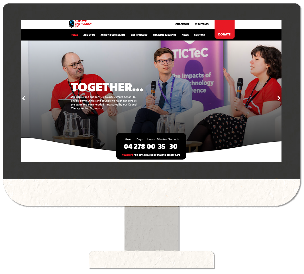
The new site is predominantly blue. We used red sparingly to highlight buttons and calls to action, directing the viewer to donate, download, become a funder, and so on.
The waves and curves that break up the individual sections of each page of the new site were inspired by the curves and melting/drips of the CEUK logo.
We achieved improved navigation for visitors to the site, with different pathways depending on the nature of their interest.


Photography is used throughout the site, featuring members of the team and images from their training and events, wherever possible. This gives their organisation a personality and paints them in a positive light. The new “Meet the Team” page underlines this friendly, approachable image.
Blogs, press coverage and case studies all use eye catching images or graphics, with a bold font and a repetition of the curve. Gone are the rows and rows of text and hyperlinks from their former site.
The new site offers multiple opportunities for people to get involved and support their work; from volunteers to funders to potential partners.
Finally, the inclusion of a LinkedIn feed on the homepage keeps the site fresh and up to date with their very latest work.
All in all, quite a transformation and we received some great feedback from the client.
We achieved improved navigation for visitors to the site, with different pathways depending on the nature of their interest.


