Love & Pamper

Overview
Love&Pamper is a Yorkshire-based company which has developed a range of plant-based, high performance skincare products using active botanical extracts.
Love&Pamper skincare products are 100% vegan, naturally derived, recyclable and made in the UK. These qualities made this project a perfect fit for A Better Planet; providing an opportunity to support an independent business with nature and sustainability at its core.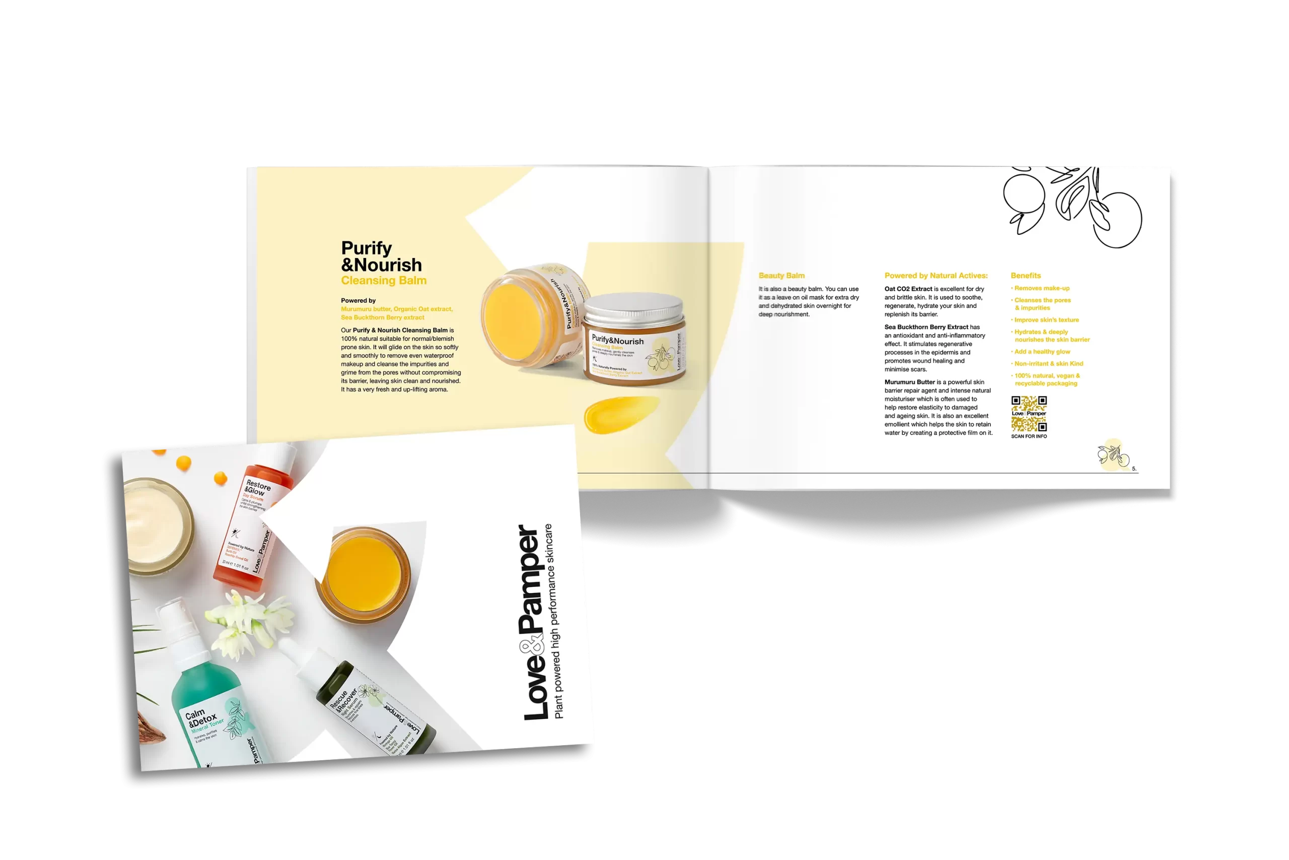
Typography
The sans serif typography emulates the brand logo, a bold solution in achieving the semi-pharma look and feel we wanted to achieve.
Website design
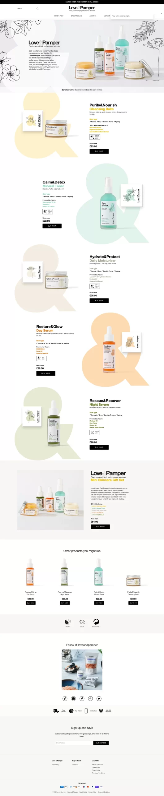
In-keeping with the clean approach, the website design is predominantly white with the use of oversized tinted ampersands that boldly denote each product. Full width photography banners showcase the full range and added illustrations reflect the hand-made feel of the plant-based brand. We then worked with an international e-commerce digital agency to complete the build and apply our full rebrand across the whole Love&Pamper website.
Brief and objectives
Love&Pamper previously offered aromatherapy and spa gift sets via their ecommerce website, but wanted a fresh new look for the launch of their dedicated plant-powered skincare product range. This included a cleansing balm, a mineral toner, a daily moisturiser, and both a day and night serum.
We were therefore tasked to:
- Create a brand identity for the new products
- Carry this through to the packaging design
- Apply the new branding to their website
- Create a set of brand guidelines
Strategy
Love&Pamper was founded by Amber and Suhail, a husband and wife team. The skincare product range has been developed by Amber, from scratch, after studying natural skincare formulation. This project was therefore very close to their hearts, so it was particularly important that they were involved in the creative process.
The design objective was to create a clean, semi-pharma look that emphasises the natural, plant-based ingredients, without feeling too ‘green’!
Brand Design
The ampersand was prevalent in the existing Love&Pamper logo, so this was the core inspiration behind the new brand design. The ampersand reinforces their brand identity and acts as a recognisable icon across the skin care collection.
Colours
Depicted by the product content, the colour palette is muted, not to detract from the semi-pharma feel and to soften things ever-so-slightly. Tinted ampersands adorn the packaging and product labels assisting in differentiating between products and acknowledging their individual, natural properties. The ampersand also features within the product titles, another notable design anchor.
Illustration
Clean white packaging, and clear messaging denote the semi-pharma look and feel and by contrast, hand line drawings have been illustrated to accentuate the handmade element and strengthen the unique properties of the main plant-based ingredients.
Photography
The importance of great product photography and videography for the new range was paramount. We partnered with a specialist packaging photographer to create the imagery that the range needed to make an impact on the rebranded e-commerce site, as well as creating some stunning photography in-house! Our clean, simplistic photography approach highlights the range and accompanying packaging, accentuating the individual product colours and encouraging standout.
We created a set of brand guidelines which have been implemented across the Love&Pamper website, social media channels and brochure design and will act as a foundation for future projects with Love&Pamper.
The new products launched in December 2022 and we’re looking forward to supporting Love&Pamper on their exciting journey into the world of skincare as they look to grow their product range in 2023.