Merseyside Cycling Campaign

Overview
Merseyside Cycling Campaign (MCC) is the leading organisation championing the benefits of cycling and campaigning for cycling safety across the Liverpool City Region. We got to know about MCC through another of our clients, the Save Rimrose Valley campaign. MCC and organisations like it are becoming increasingly more relevant and important in today’s world. This is because active travel (which includes cycling and walking) is seen as part of the answer to tackling the negative health impacts of air pollution and climate-wrecking CO2 emissions which come from vehicles on our roads. We wanted to support an organisation which is all about encouraging people to ditch their cars, making this as easy and safe as possible, getting healthy in the process… and improving our environment. What’s not to love?!
Brief and objectives
For this project, we approached the client with an offer to help, identifying two key areas we believed could make a real difference to their work:
- Brand: MCC had an existing brand, but we felt that there was an opportunity to make this more contemporary to help them appeal to a wider audience. We challenged ourselves to come up with something that was welcoming, forward-looking and in tune with the zeitgeist and cycling’s place in this.
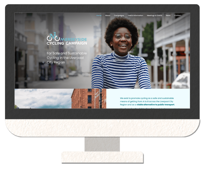
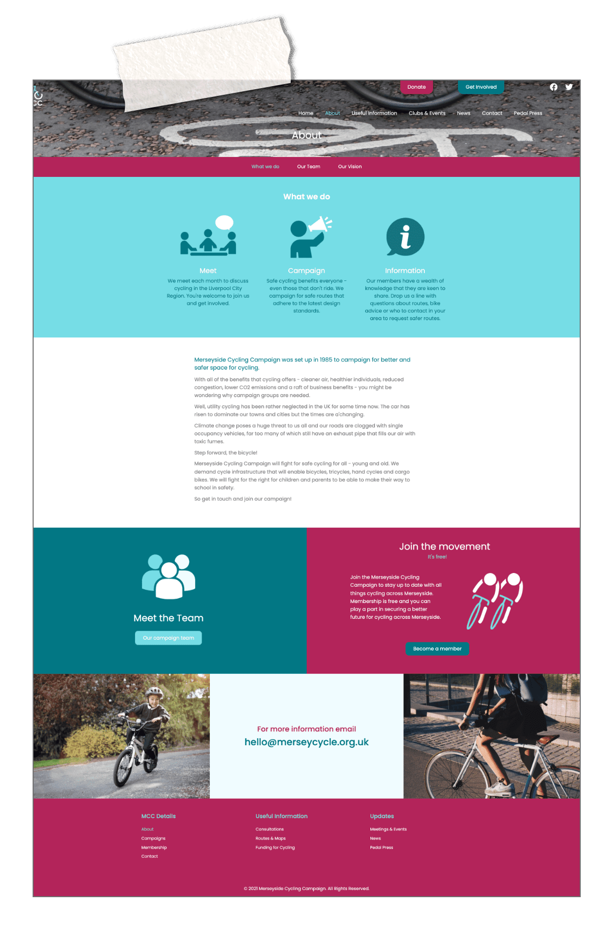
- Website: MCC do important work, so we wanted to deliver a website that reflected this. As well as introducing their new branding, we wanted to tell their story so that visitors to their website immediately knew what they were all about and were greeted by positive messages about cycling and its many benefits. The site was to be as user-friendly as possible, making it easy for people to find out important information and to support the group’s work.


Strategy
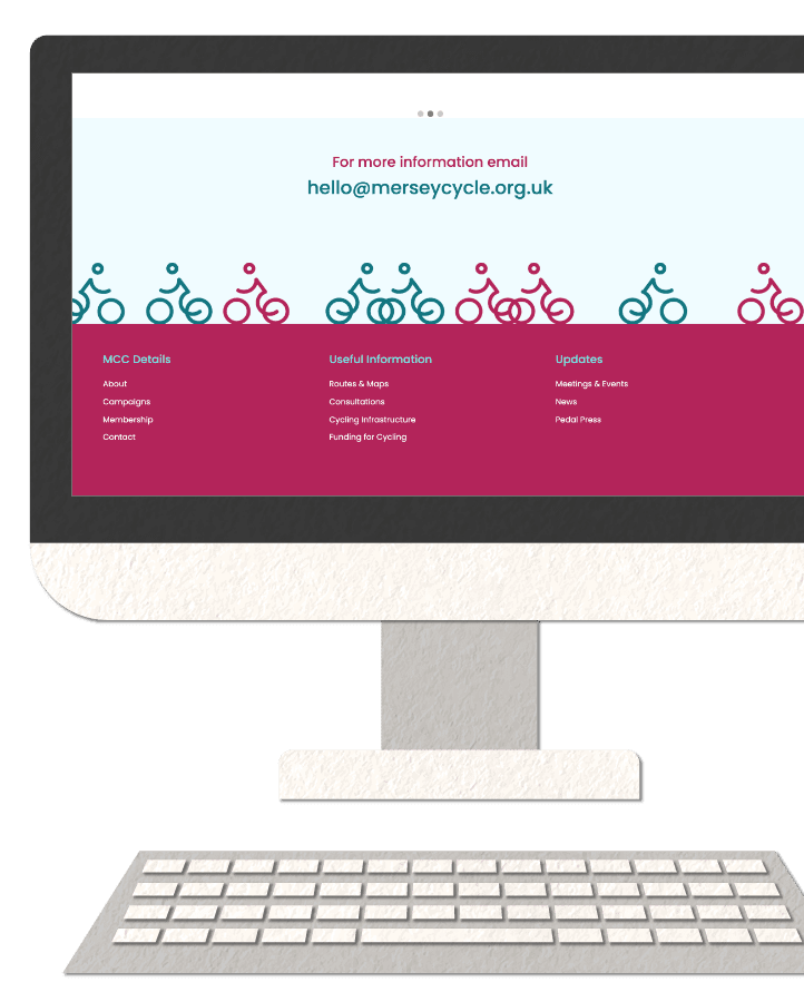
The campaign group aims to promote cycling and to make it more accessible, so our goal was to breathe new life into the brand, to appeal to old, young, cyclists and non-cyclists alike. We floated the idea of a name change, along with a different logo, but following discussions with the client it became clear that their existing brand mark, which used the letters ‘MCC’ to create a bike was popular with the board and members. However, we felt that the existing ‘road sign’ style was a little formal and authoritarian. So, we took on and enhanced what was already working: the two Cs forming the wheels, and the M forming the bike. We modernised the form with uniformed lines and rounded edges and created a really playful ‘M’ that was reflected in the written logo as well as the brand mark. A simple change with huge impact!
We drafted a strapline for the organisation; a one sentence manifesto, if you like. “For Safe and Sustainable Cycling in the Liverpool City Region” tells people what they’re about at the very first opportunity. We also wrote a more detailed mission statement which would feature prominently on the homepage of their new website.
For the website itself, MCC is all about encouraging people to cycle more; for commuting, for pleasure and everything in between. This led to a deliberate use of quality photography throughout the site, making the subject matter easy to relate to and portraying cycling – and cyclists – in a positive light. The images chosen portray cyclists in everyday situations, with and without helmets and in regular clothes, reinforcing the message that cycling is for everyone. We wanted the homepage to immediately engage and to explain the relevance of cycling in today’s world and the inclusion of key facts about cycling, along with a testimonial from the City Region’s Walking & Cycling Commissioner do just that.
In terms of the website’s content and layout, we began by completing a review of their existing site and identified several key areas we wanted to improve, including:
- Making it immediately obvious what the group was about and the work they do
- Bringing their news items to the forefront of the site, including their wonderful newsletters
- Making the group more personal and approachable and making it as easy as possible for people to engage with them and support their work
- Introducing their team and making the people who run the organisation more visible.
Design & Navigation
When it came to the design, we explored various colour palettes to reflect the new, friendly tone. We looked at sportier colours such as orange and green, and even bright, almost-neon palettes, but we and the client kept coming back to the mix of blues and burgundy, which had a modern, yet sophisticated look. We were keen to make sure it appealed to multiple age groups and genders too. It was a conscious decision to avoid what might normally be associated with outdoor colours - greens and oranges - which are statistically unpopular with women. This was further justified by the fact that cycling take up by women is significantly lower than men.
The navigation was a large part of the website process and there were a few iterations until we settled on the final menus. We wanted to keep primary navigation menu as minimal as we could whilst keeping it obvious to the user where to find things. We split up ‘Campaigns’ and ‘Useful information’ and gave space on the primary navigation for both dynamic pages ‘News’ and ‘Meetings & Events’. We then developed a clear secondary menu where users could see all the active campaigns and ‘useful information’ pages below and switch between them with ease.
We're happy to report that MCC were extremely pleased with the results and we look forward to continuing our work with them and helping them grow their organisation.


