Transport Action Network (TAN)

Overview
Transport Action Network, or TAN, was formed in 2019. Its purpose is to support people and groups campaigning for more sustainable transport in England and Wales. This involves fighting cuts to bus services and opposing damaging road schemes and large, unsustainable developments. Although a new and relatively small organisation, TAN punches well above its weight, with a network of contacts at many of the biggest NGOs operating in this sector. A Better Planet crossed paths with TAN via our work on the Save Rimrose Valley project. TAN has offered incredible support to this campaign and we spotted an opportunity to return the favour.
Brief and objectives
For this project, we approached the client with an offer to help, identifying two key areas we believed could make a real difference to their work:
- Brand: Although already an active and recognised organisation, a clear identity and brand had yet to be defined. The client was keen to strike the right balance between appearing professional, without being too corporate, as its primary focus is to connect with and to support members of the public. Equally, they wanted to avoid appearing too informal.
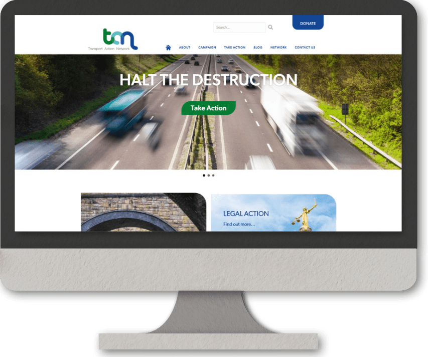
- Website: TAN’s work, including recent, high profile legal challenges, has meant that it reaches a much wider audience than within its sector alone, often attracting national media coverage, driving more and more traffic to its website. The task was therefore to carry through the new branding to the group’s website and to explore ways in which it could be made more user-friendly
Strategy
For the group’s brand, we established that it was important that their acronym became part of this as it was how they referred to themselves and how they had become known more widely.
The form of their new logo is representative of transport links; an aerial view of a rail track, road, or a route with the continuing graphic line denoting movement. Linking the letters represents the help and support that TAN offers individuals, groups and campaigns. Hard hitting yet approachable, the use of lowercase and curves soften the brand whilst losing none of its impact.
For the website, although the content on the client’s existing site was all in place, we felt that in addition to a fresh design linked to the new branding, there was an opportunity to present this differently and to improve navigation. Many of the pages were text-heavy, which was something we were keen to address.


Design & Navigation
There is a deliberate use of quality photography throughout the site, making the subject matter easy to relate to. We introduced rotating ‘hero’ banners, highlighting 3 key areas of their work. The homepage is clean and has impact through the use of stylised tiles, mirroring the curves of the new branding.
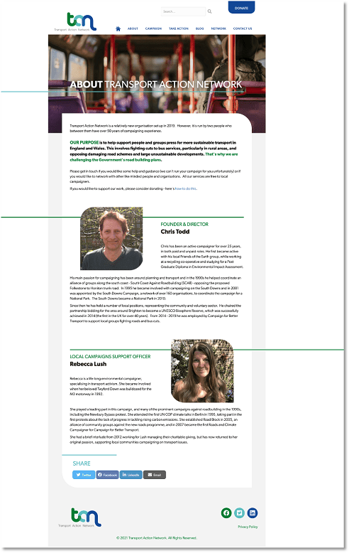
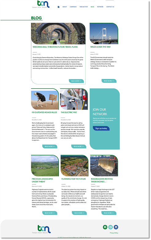
We improved navigation, recategorizing existing menu options, creating new landing pages, offering a summary of the content that follows. Wherever possible, we designed icons to further categorise documents, replacing what were previously headings, again, breaking up text-heavy pages. Adding in side menus made moving around the site even easier, avoiding the need to return to the main menu.
Finally, we created a new ‘sign-up’ form, aimed at increasing engagement and a stylised donate button replaced the previous PayPal default. A ‘share’ function was added to all pages with useful content, giving visitors the opportunity to spread news of their work. All of this was carried over to the group’s presence on Facebook, Twitter and LinkedIn, reinforcing its position as a professional and credible organisation.
We look forward to supporting TAN as their organisation grows and are proud to be associated with a group that is bringing legal action against the government’s road building plans in order to protect our planet. Our work with them has already led to an exciting new project in the pipeline for 2021!


